Website Essentials for Travel Businesses: What Actually Converts Bookings
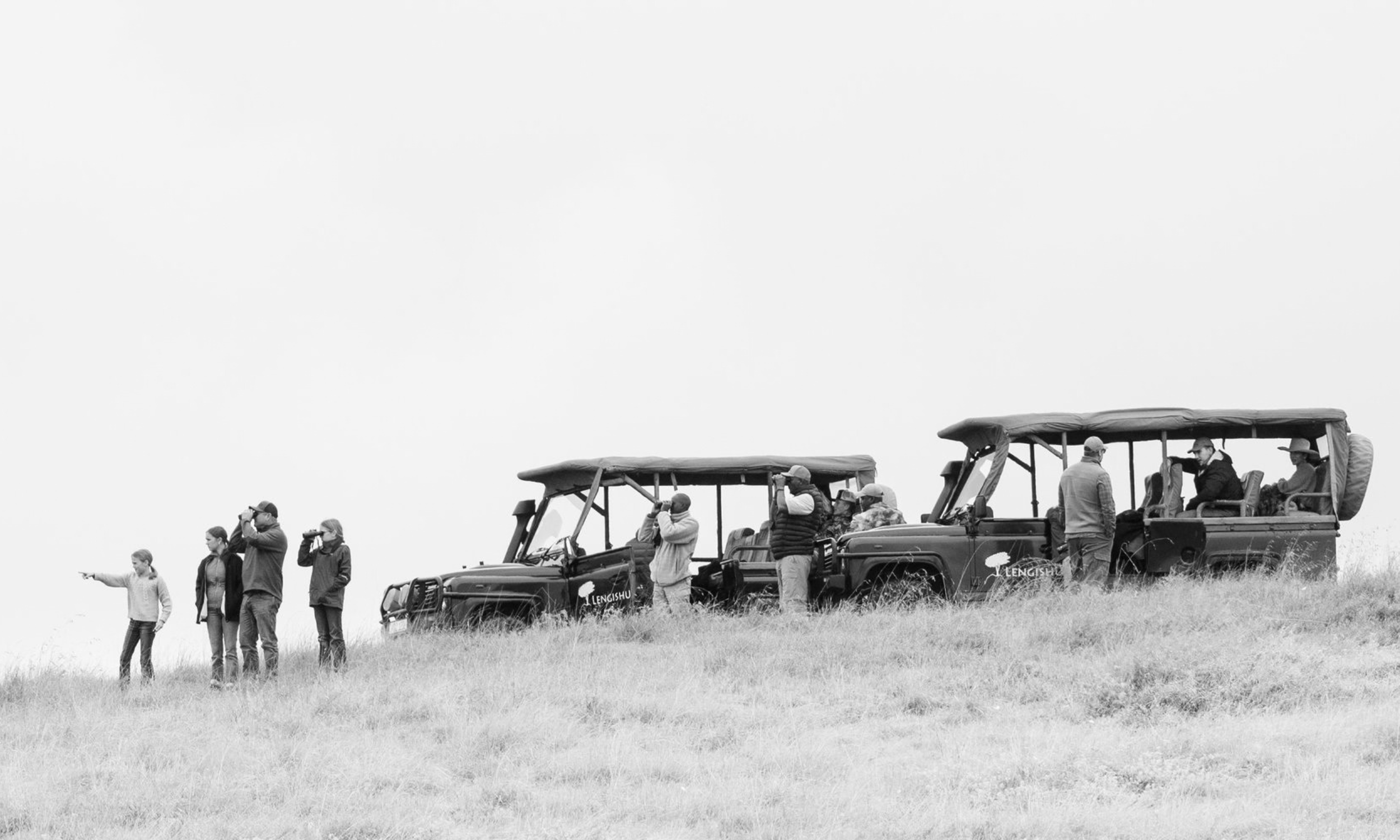
A travel business website converts bookings by doing one thing well: helping a visitor picture themselves on the trip before they ever reach out. That means real photography instead of stock images, a clear sense of what the experience actually includes, trust signals woven throughout the site rather than tucked away on a single page, and an inquiry process that doesn't feel like being sold to before you've even asked a question. Get those right, and a website becomes something your social media following can't be: a place someone actually references before booking.
Here's what that looks like in practice.
Why Travel Websites Are Different From a Standard Business Site
Most websites are built around a straightforward path: land on the site, understand the offer, buy or book. Travel, especially bespoke or high-ticket travel, rarely works that way. Nobody impulse-books a $2,000-a-day safari the way they'd order a product off a page. The website's job isn't to close the sale. It's to build enough trust and enough imagination that a visitor is ready to have that first real conversation.
That changes what the site needs to prioritize. Instead of optimizing purely for a fast checkout, a travel website needs to optimize for a slower kind of conviction: this feels real, this feels like us, this is worth reaching out about.
The Essential Pages a Travel Business Website Needs
• Home — sets the tone immediately and should make it obvious what kind of experience this is
• Story/About — who's actually running this, and why. Travelers are trusting real people with a meaningful trip, so this page carries real weight
• Experiences/Trip Types — the different kinds of trips available, since no two travelers want the same thing
• Stays/Accommodations — where people will actually be staying, shown clearly, not vaguely implied
• Activities — what fills the days beyond the headline experience
• Inquiry/Contact — a clear, low-pressure way to start the conversation
Notice testimonials aren't listed as their own page. That's intentional. Testimonials work better woven directly into the pages above, placed right where someone is deciding whether to trust what they're reading, rather than isolated on a page most visitors never click into.
Design Elements That Build Trust for High-Ticket Travel
Original photography matters more here than almost any other type of business. Stock images lose trust immediately, and travelers can usually tell the difference without even thinking about it consciously. A travel website is really a way of telling a client's story before they've lived it, and the imagery needs to help someone imagine themselves there, not just illustrate a generic idea of “vacation.”
Beyond photography, the site should read like it was written by someone who actually knows the destination and the experience intimately, not like generic travel-industry copy that could describe any company. Specificity builds trust. Vague, sweeping language doesn't.
Should Travel Websites Show Pricing?
This is genuinely different for travel than for most industries, and it depends on positioning. Some of my premium travel clients do show a daily rate on their site, and there's a real reason for it: it filters out visitors who don't have the budget before they ever reach out, saving everyone time.
What I generally advise against, though, is package pricing. Listing set packages with fixed prices makes a premium, custom travel business look like a franchise travel agency selling the same trip to everyone. If the whole point of the business is that every trip is designed around the traveler, the pricing structure on the site should reflect that same philosophy. A starting daily rate can signal “this is a premium experience” without collapsing the sense of customization that's actually the product.
Rethinking the Inquiry Process
We're living in a moment where a lot of people simply aren't comfortable picking up the phone to inquire, especially early on, while they're still just gathering information and don't want to feel like they're being sold to. A simple contact form is the baseline, and it works fine.
But there's a more interactive option worth considering: turning the inquiry into something closer to a short, guided quiz. A few thoughtful questions about trip type, timing, group size, and interests, presented step by step rather than as one intimidating form. This does two things well. It feels less like submitting your information into a void, and it gives couples or families a shared, low-pressure way to work through what they actually want together, before ever talking to a person. For a business where the decision often involves more than one person, that shared moment matters.
A Note on Video
Video can be genuinely powerful for a travel brand, but it comes with real tradeoffs worth understanding before using it. Large video files can slow a site down significantly, especially depending on a visitor's connection speed and device, and in some cases the video simply won't load properly at all. Given how often travel sites are browsed on a phone, often on mobile data rather than solid wifi, that risk is real. In most cases, a strong image does the job more reliably than a video that might not even play.
If you do use video, avoid embedding directly from YouTube. Beyond the visible YouTube branding pulling attention away from your site, it also invites visitors to click away entirely into a feed of unrelated videos, which is the opposite of what you want on a page designed to build trust in your specific brand. Hosting video natively through Squarespace or through a platform like Vimeo keeps the experience contained and on-brand.
Mobile Comes First, Not Second
For most small businesses, mobile responsiveness is simply a baseline expectation. For travel specifically, it deserves extra priority. A huge amount of trip inspiration browsing happens on a phone, often outside of any real planning session, someone scrolling before bed or during a commute, imagining a trip they might take. If the site feels clunky or slow on mobile, that moment of imagination gets interrupted, and it's genuinely hard to get someone back into that headspace a second time.
Why Referrals Need a Website Too
A lot of travel businesses lean heavily on social media and word-of-mouth, and for good reason: those referrals are often exactly how new clients find them. But a referral alone isn't enough to convert. Someone who hears about you from a friend still wants a reference point to actually look at, and a social media post just scrolls past. It's not something a potential traveler can sit with, share with a partner, or come back to later while they're deciding.
That's exactly the gap a website fills. It gives a referred traveler somewhere real to land, a way to actually picture the trip they're being told about, before they ever reach out. Without that, a lot of warm referrals quietly go cold simply because there was nothing solid to look at.
Common Mistakes Travel Websites Make
Relying entirely on stock photography instead of real, original images
Listing fixed packages and pricing that make a custom travel business look like a franchise agency
Vague, generic copy that could describe any travel company
Testimonials buried on a separate page instead of placed where they're actually persuasive
Embedding YouTube videos that pull attention away from the site
Treating the site as an afterthought to social media instead of the reference point it needs to be
What This Looks Like in Practice
I recently worked with Conway's Africa, a private safari company built by two brothers who'd outgrown the website they started with. You can read the full story in the Conway's Africa case study, including how we rebuilt their site around real storytelling and turned it into something referred travelers could actually reference before booking.
Related Reading
Conway's Africa Case Study | What to Expect When Hiring a Freelance Web Designer
About Me
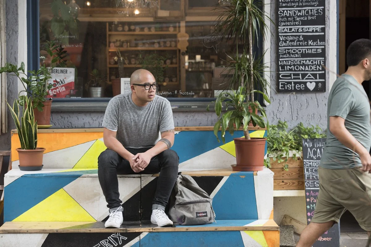
I'm Shawn, a Brand Strategist and Squarespace Web Designer based in New York, with over 20 years of experience in marketing, sales, and design. I work with travel businesses to build websites that go beyond a pretty gallery of photos, sites that actually tell your story and give referred travelers a real reason to reach out before they ever pick up the phone. If your travel business has outgrown a website that isn't helping people imagine their trip, let's get on a call.
Frequently Asked Questions
-
At minimum, a home page, a story/about page, pages covering the types of experiences and accommodations offered, an activities overview, and a clear way to inquire. Testimonials work best woven throughout these pages rather than isolated on their own.
-
Original photography makes a significant difference for travel businesses specifically. Stock images tend to break trust quickly, since travelers can usually sense when imagery doesn't reflect a real, specific experience.
-
It depends on your positioning. Showing a starting daily rate can help filter serious inquiries, but listing fixed packages tends to make a premium, custom travel business look like a franchise agency rather than a bespoke one.
-
Video can be effective, but it also risks slowing down your site or failing to load on slower connections, particularly on mobile. If you use it, host it natively through Squarespace or Vimeo rather than embedding YouTube directly.
-
Yes. Social media is great for discovery, but it isn't a reference point. A website gives referred travelers a place to actually sit with the idea of booking, which a scrolling feed can't provide.